 |
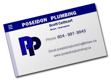
| Their old card. |
The first thing we did was find out if we could clean up their logo a bit. The Ps were redrawn, their spacing and colour were adjusted, and the stroke was permanently removed to lend the logo a cleaner, more professional look.
The company's name was added and with it a faint gradient to the name and the foreground P.
Using the updated logo, we designed them a business card complete with a spot gloss on one side (that's what the bubbles are), and are very happy with the results:
(Click on the card below to flip it over.)


